TheXPlace is a community and marketplace offering a new way to connect and find work in the gaming industry. Ilya Sizov, the Head of Design at TheXPlace, details the intricacies of how it was designed.
Designing for the gaming industry is unique: Each gaming universe has a distinct reality with different aesthetics and user experience particulars. In this article, I explain the value of decisions while designing TheXPlace and show the behind-the-scenes process.
The Challenge
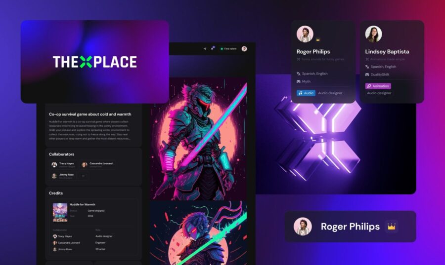
At TheXPlace, we work to make hiring and obtaining jobs within the game industry easier for candidates of all backgrounds. To ensure the perfect pairing between companies and their prospective talent, we provide the talent with tools to showcase their skills, experience, and personality. So, my first challenge was to design TheXPlace as a personal professional space where users can build their digital identity.
There is one thing that all good games have in common: They are satisfying. Another challenge I was presented with while designing TheXPlace was to shape the visual look and feel in a way that people would enjoy and to guarantee a pleasing user experience.
Step 1: Finding the DNA
In the beginning, we already had a vision for the various functions and possibilities TheXPlace needed as a product. But from a design perspective, I had to start from scratch. It was imperative that we were able to deliver to the world as soon as possible so that we could start communicating with our investors and potential users. To start fast, I knew we needed a simple and powerful visual language.
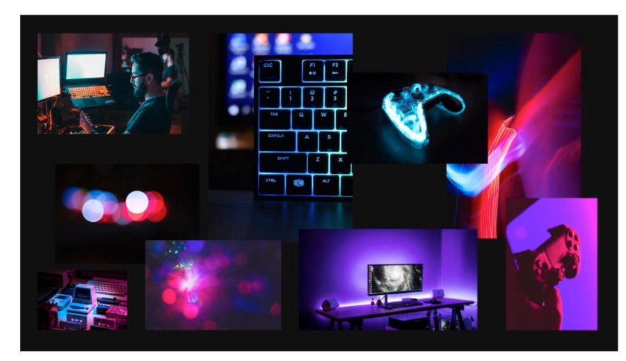
Our reference visuals consisted of various game-related assets: game UIs, gamers’ accessories, photos of gamers playing. Gaming is a primarily digital process consisting of light-emissive objects: screens, keyboards, controllers, setups, computer towers. I wanted to implement this aesthetic and translate an atmosphere of a cozy late-night gaming session to make our users feel a welcoming familiarity while at TheXPlace.
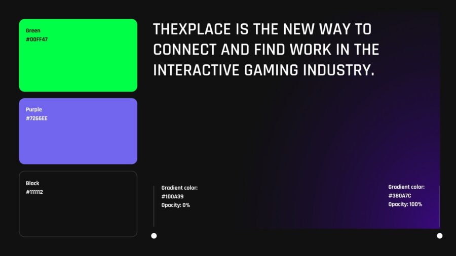
This idea led to our decision to use a dark theme with bright lights as accents. I utilized a black background and added a primary color, as vivid as possible, with soft gradients to complement it. The initial font choice was a squared and condensed geometric font called Rajdhani which had that distinct gaming look and provided the aesthetic connotations we were aiming for.
Step 2: Creating the Identity
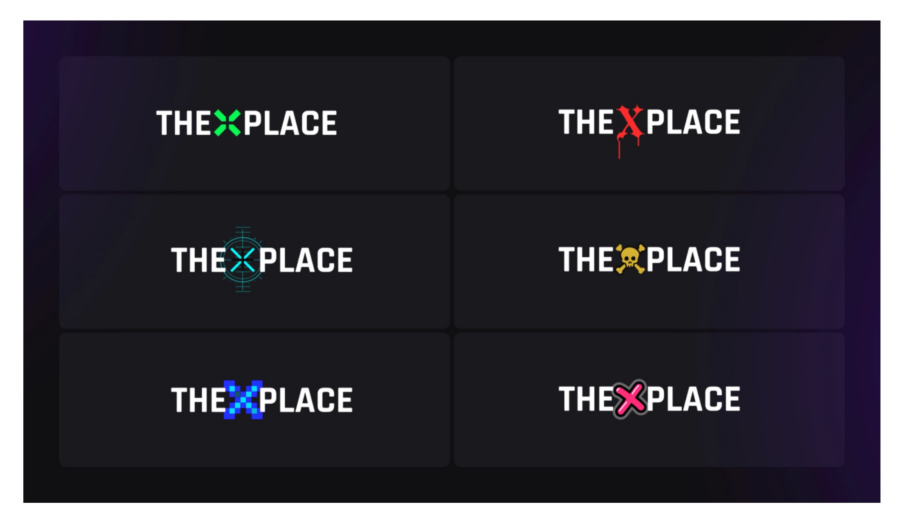
The X in the company name stands for the talent X-factor – their defining traits and best merits. Because of its importance, I knew the X needed to be the center of the logo.
The X, while a very simple form, has many game-related associations, the most obvious one being the D-pad of a game controller. I also explored the idea of creating the X as a separate button, but it seemed too concrete.
I ended up with a really simple version but disconnected the strokes of the X to make it look more like a cross from a controller. it’s not too straightforward and might remind a gamer of various things aside from a D-Pad (a target, arrows, HUD elements, etc.).
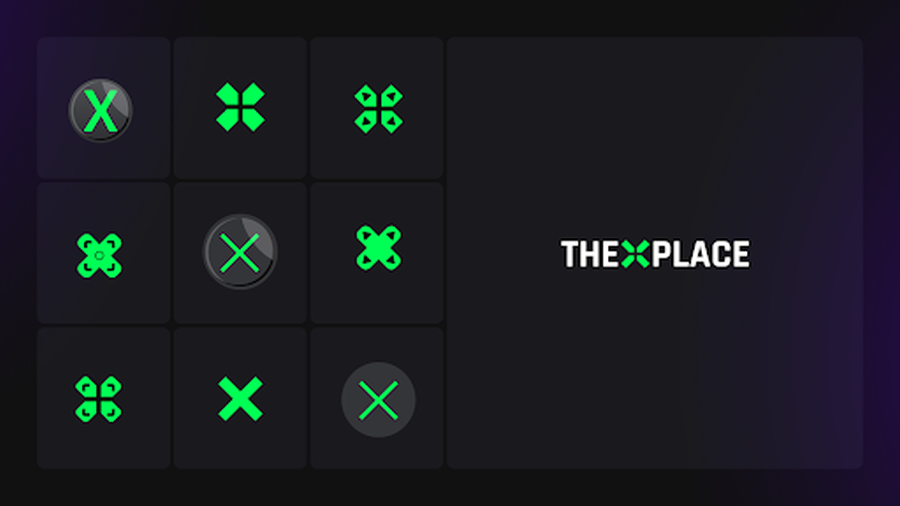
Developing this direction further, I saw how the X could transform into anything, accommodating different game aesthetics. Keeping the basic version simple and leaving some space for stylistic alternatives gave me just enough flexibility to make sure the logo would adapt to versatile gaming industry contexts.
Step 3: Defining the UI Aesthetic
In parallel with the logo, I was working on the visual language of our UI. That was a natural expansion of what I had set up in the previous step but with all UI-related limitations and requirements.
There were many questions to take into account: how the interfaces would be assembled in terms of layout, sizing, and spacing, what shades of base colors were needed, font versatility for adaptation to various needs, the iconography that we would use, and other scalability-related aspects.
At that moment, I was not working yet on a proper design system for our product UI, as this is a very time-consuming and meticulous process that can take many months. I was focused on finding the core of our product’s look and feel, so it was enough to define a limited but effective set of rules.
Step 4: Building the Wireframes
At the beginning stages of a start-up, it is imperative that everything is coordinated efficiently to ensure a swift successful launch, so many tasks were completed parallel to one another.
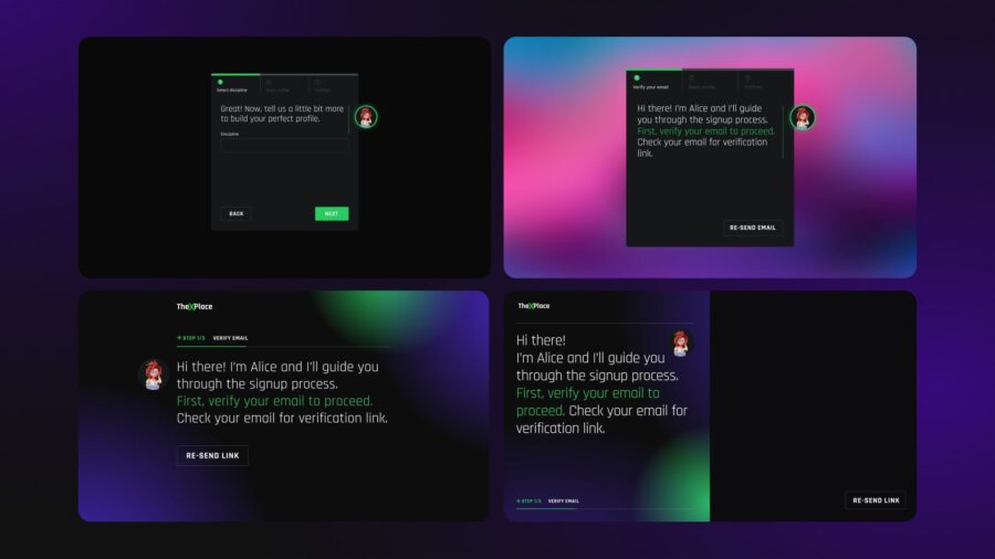
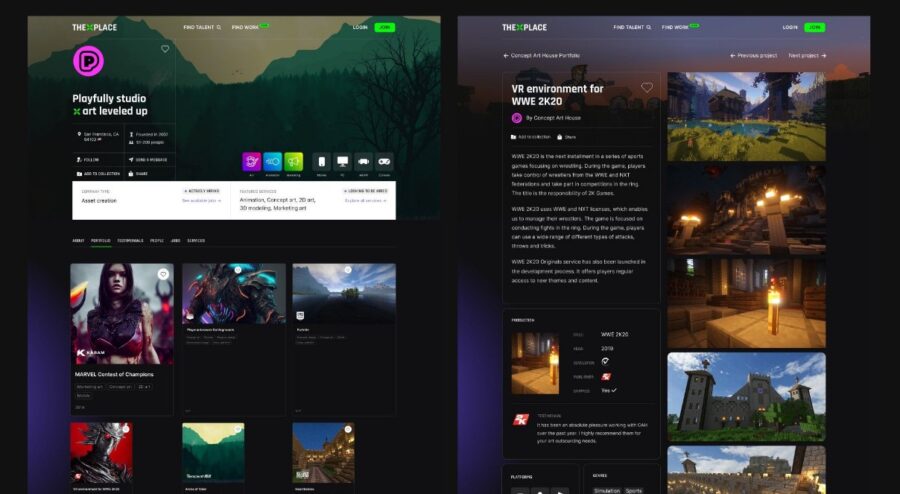
We needed to define the core functionality and architecture of our MVP through UX research. In the beginning, the product was going to focus on the supply side of the marketplace, so I started with the wireframes for our user profiles.
This is the process where you go through multiple iterations over and over again, refining the functionality and content and testing things endlessly. Over time and an overwhelming number of iterations, the project’s demands come into focus and a clearer image is represented after sifting through various drafts.
Step 5: Moving to Higher Fidelity
With wireframing in action, it was time to create something more tangible. While wireframing took an exorbitant amount of energy, it was unable to boost us emotionally and I felt the project was remaining in an abstract state. In order to move forward, I reviewed the visual language aspects and tried to merge our wireframes with the look and feel foundations that I had previously defined.
After finding success in particular elements, I was able to come up with the first, very rough explorations of the interface.
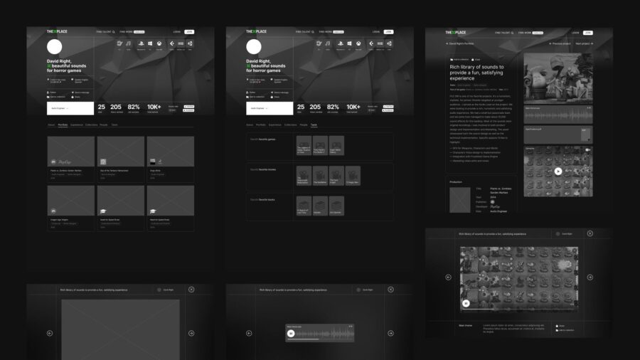
I wanted to let our users’ work speak for itself; that’s why most of the UI room was dedicated to showcasing the body of work. Graphics-heavy UI is a familiarity in the game industry and supporting this visual convention was one of the reasons to choose this direction.
Step 6 and on: Developing the Design System
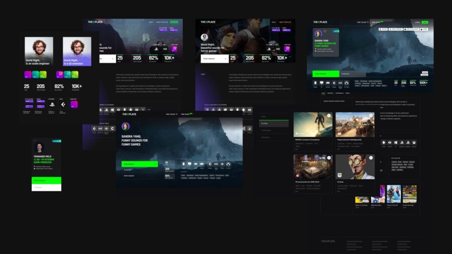
As we moved further down the road of our interface evolution and multiplication of all the pages, views, and interactive states (with the development continuing in parallel), it was crucial to build a good design system. I needed to make sure we kept consistent and polished UX and UI across all the small segments of our platform.
To make it work, all the designs should be built on a comprehensive system of so-called design tokens — shared variables such as sizes, spacing, colors, typography styles, etc.
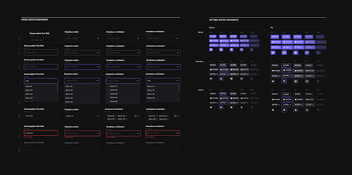
When you have the basics set up and the design system at hand, all future improvements become controllable and don’t break the fundamentals, even in the case of pretty big revamps.
Next Steps
You can say you’ve built a foundation once you have created some tools to communicate as a brand and moved forward as a product. After defining the basic principles of brand identity and developing the core of the product design system, I had the tools to move forward with both marketing communications and product design.
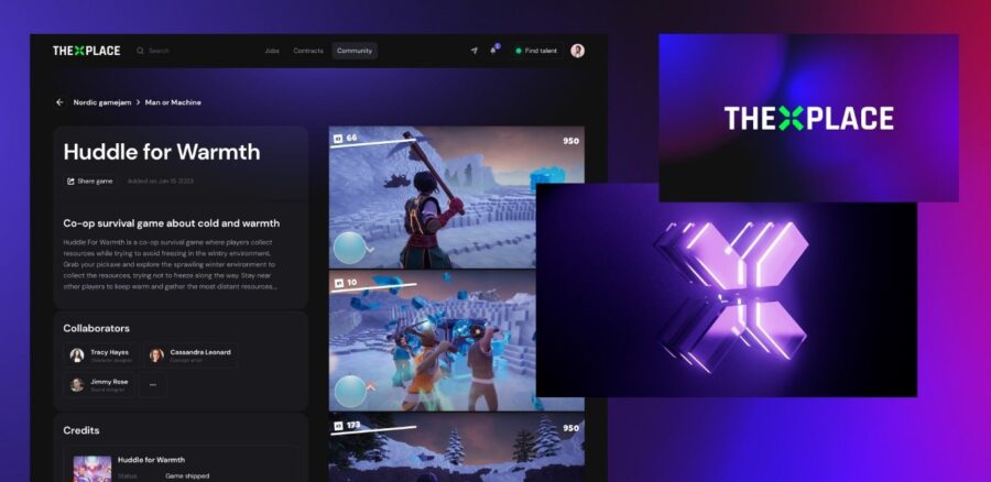
We’ve come a long way since then: launched the product beta and the promotional website, participated in a bunch of offline events, and collaborated with some game design institutions. Currently, we are working on the next version of our design system and are constantly improving our design practices in general. This is an ongoing process with no end in sight.
Takeaways
Designing for an early-stage startup can be energy- and resource-consuming, especially for a perfectionist. Not having enough time to explore different ideas and polish the ones you choose can be frustrating.
But being a designer means working with limitations. With tough requirements and a dense timeline, you get a chance to see and enhance the core idea of your design. Even with all the restrictions, you can maintain quality and make the project shine; you just need to focus on the most important aspect of the design. It can be the value it brings to the users, the consistency and scalability, or the visual and emotional impression it creates. In my case, it was a specific gaming vibe that helped keep everything together and allowed me to enjoy the process as a designer and have some fun along the way.
Focus on what matters most and stick with it through the whole process. It will give you a true sense of ownership and make you love what you do.